HTML, CSS, JavaScript,
User Experience, Instructional Design
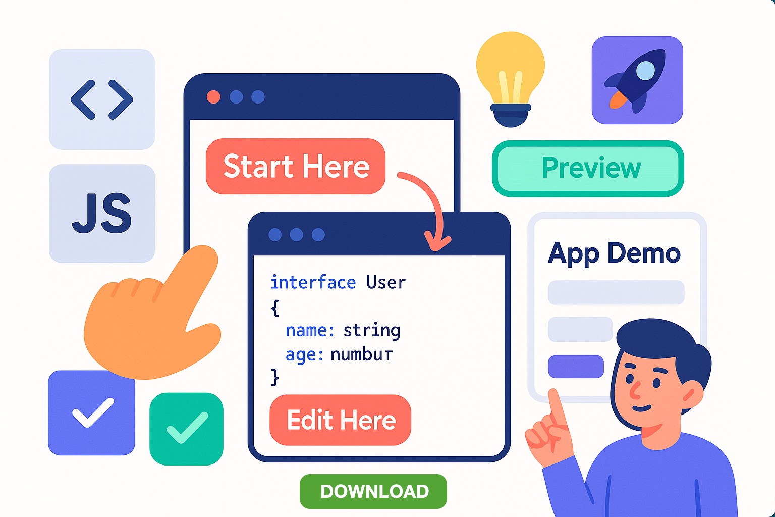
I've simplified the course content for a technical course and converted it to HTML with interactive elements to make it easier for students to:
- access reference materials easily,
- follow instructions,
- know which files to edit,
- understand concepts before code,
- understand what they are supposed to be building,
- compare their work to a functioning application
I also reduced the heirarchy in the Learning Management System to make it easier to find information.
See a complete comparison at the end.
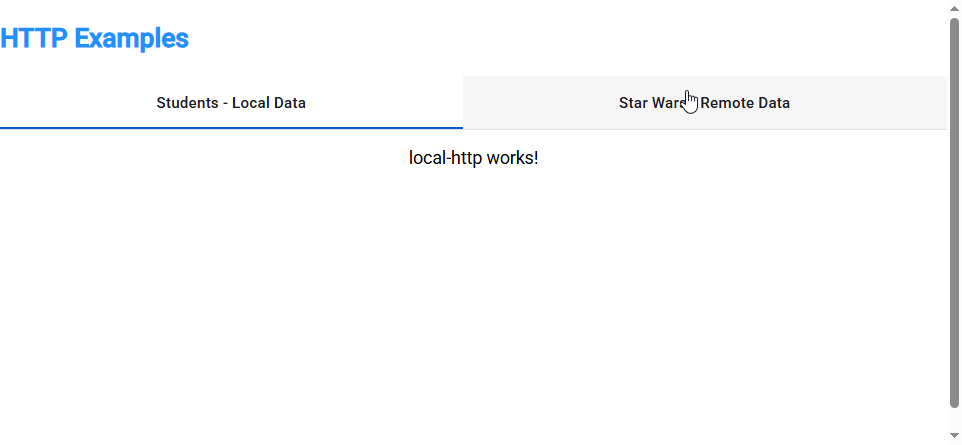
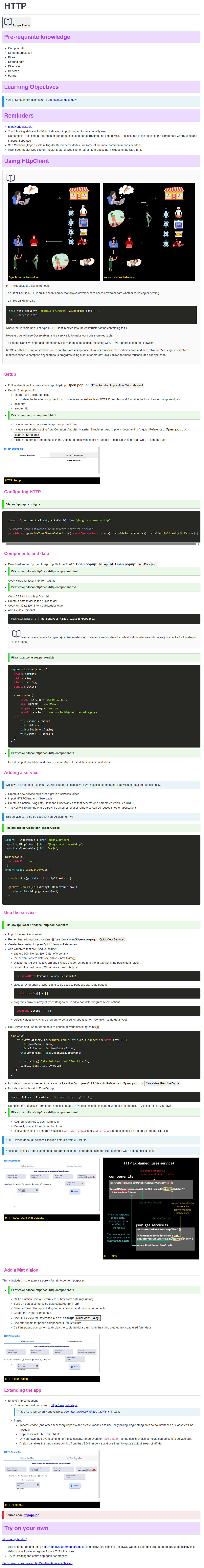
Access reference materials easily
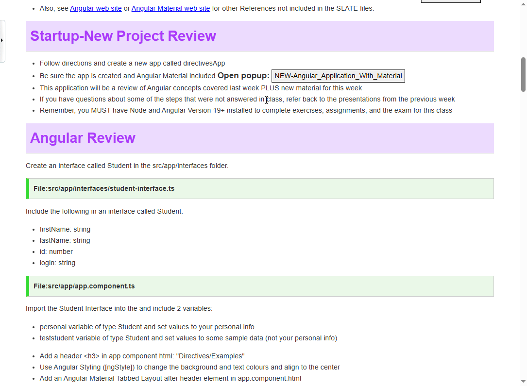
Students had a difficult time navigating between main course material and references that were needed to complete course material. I created a pop up control that allowed students to quickly access reference material without Interrupting their current flow. That pop up was styled differently to indicate that it was reference content, not the main content. Students spent their time more efficiently and stayed focused on the main task.
Follow instructions
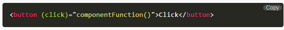
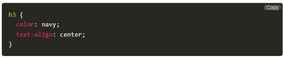
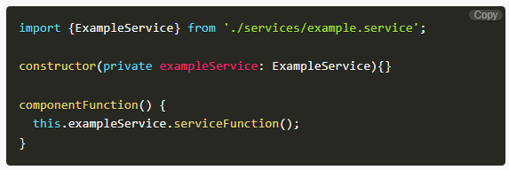
In the previous course content, code snippets were not clearly distinguished from surrounding text or effectively highlighted. To improve this, I introduced an interactive component that styles code according to its language and includes a convenient copy button for student use. While this feature enhances accessibility, it carries the risk of encouraging students to over-rely on copying without fully understanding the code. This user experience enhancement will be monitored and refined in future semesters based on student interaction. In a test group, students were aware of the potential for misuse and generally avoided it, while those reviewing material found the feature helpful for reproducing application code faster.

In later course modules, prior knowledge was required. Before the re-design, students would need to navigate back to previous content, find what they needed, then resume their exercise. I added "note" indicators clearly indicating what prior knowledge was required. Students more clearly understood exactly what they were looking for, and in most cases, had the reference available via a convenient popup. Notes also acted as a reminder to students to ensure that they included any prerequisites and avoided any pitfalls. "Notes" were also used to point out easily-oerlooked content elements.They were able to understand and access what was needed without having to scan through another module's content entirely.

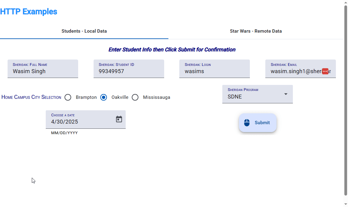
Know which files to edit
The course content is very technical and involves many files. Students identified this as a pain point and it was observed that many times they were editing the wrong files resulting in incomplete or error prone applications. I added indicators to the content clearly indicating which files should be edited in the next step. As a result students were able to follow technical instructions effectively and create functioning applications faster.

Understand concepts before code
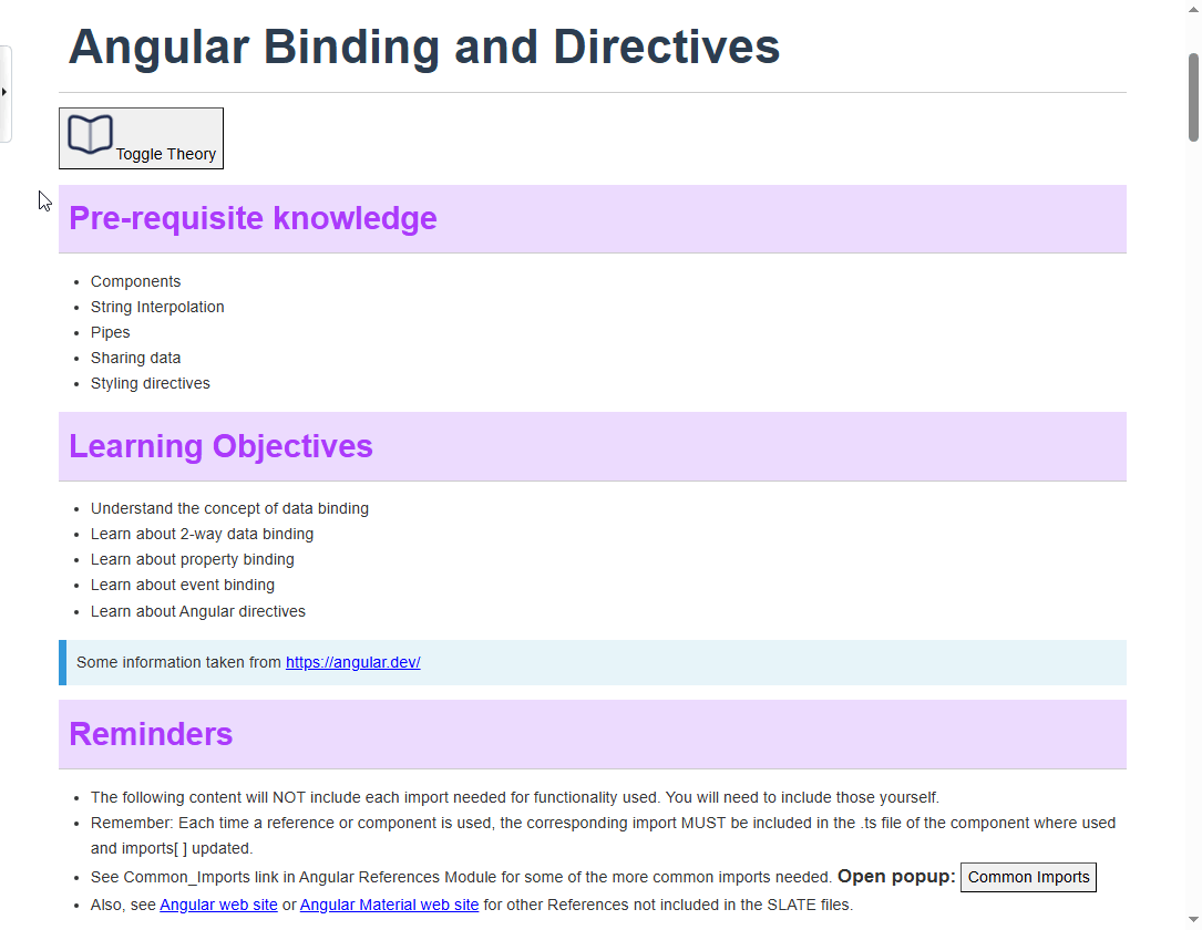
The course content combines both theoretical concepts and practical exercises. However, having the ability to view only the theoretical material serves two key purposes: it allows students to build a conceptual foundation before engaging in hands-on work, and it offers a focused resource for exam preparation. The introduction of a "Toggle Theory" button enabled students to easily switch to a theory-only view, supporting both learning and revision more effectively.
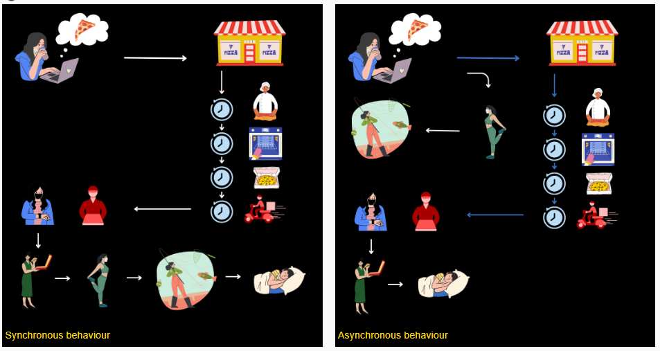
The prior PDF version omitted conceptual illustrations or diagrams, limiting visual representation of the underlying concepts. While my focus was just redesigning content, I could not ignore this glaring omission. I created relatable conceptual diagrams that transitioned students from concept to code. Students expressed that they understood the concept more clearly and how the code was implementing that concept. Previously they weren't exactly sure what problems the code was solving.
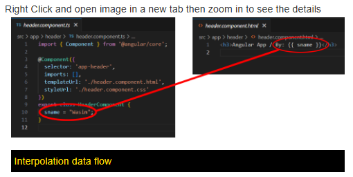
Students stated that there were many files and they did not know how they worked together in the gramework. Code-flow diagrams were included to better illustrate the relationships between different files. These eleemnts promoted understabding of complex relationships between files in the framework
Understand what they are supposed to be building
A common student complaint was the lack of clarity about the purpose behind the code they were writing—they felt they were coding without truly understanding what they were building. Additionally, there was no feedback mechanism to indicate success. To address this, I introduced step-by-step animations that visually demonstrate the intended outcomes. These clear visualizations provided students with a concrete understanding of their goals, allowing them to easily assess whether they had successfully completed their tasks.
Step 1
Step 2
Step 3
Step 4
Compare their work to a functioning application
Finally, even when students grasped the concepts and believed they had followed instructions correctly—editing the right files and placing code where it belonged—some applications still failed to work. The course material is highly specific, and even a single missing character can cause the entire application to break. To address this, I developed and shared fully functional versions of each application. This allowed students to compare their own code against a working reference, helping them quickly identify errors or omissions and make faster progress toward their goals.

Reducing hierarchy
With less nested content and modules, it was easier for students to find what they needed. They also felt less intimidated by the content. This was made possible through the implementation of content UI elements, such as popup references. In fact, the "References" section in the re-designed course isn't required but it provided for quick access to specific tasks.
Before

After

Content: Side by side comparison
See a complete comparison below.
Before
After
Contact me for more details.